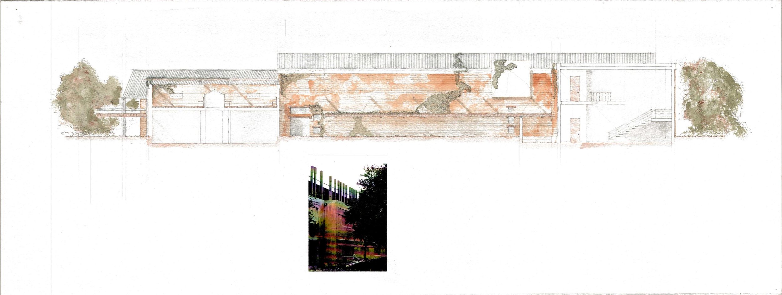
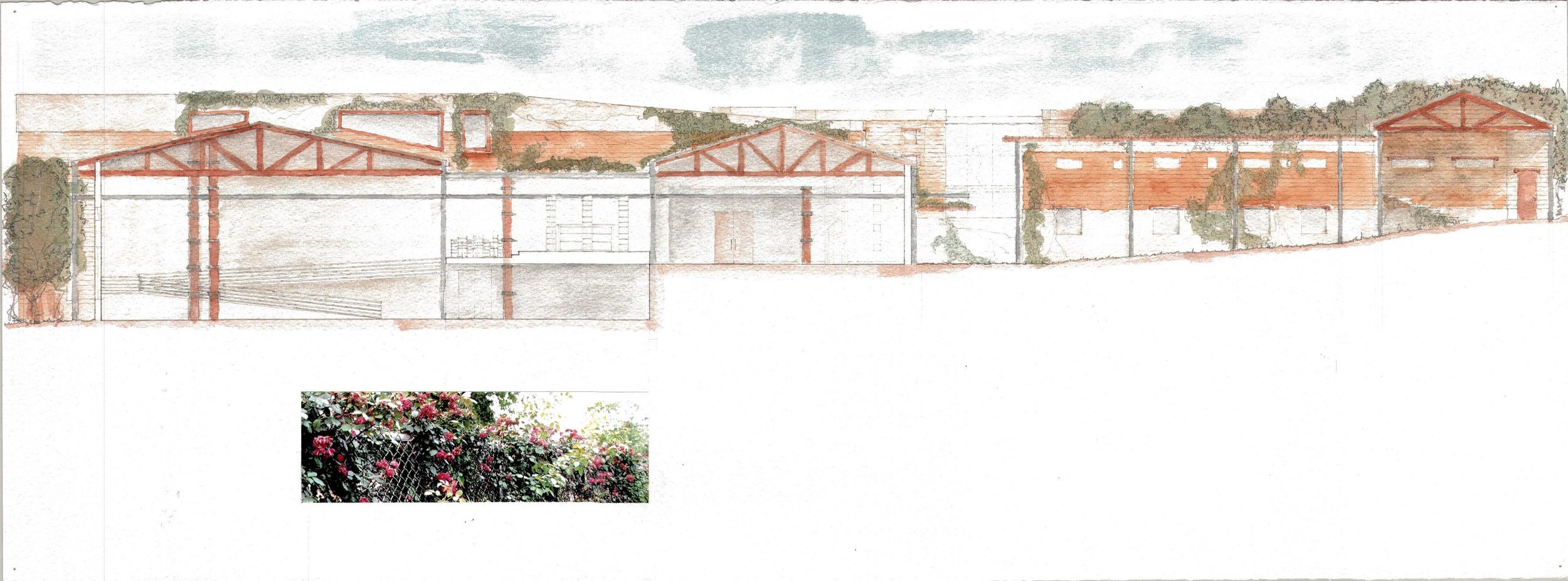
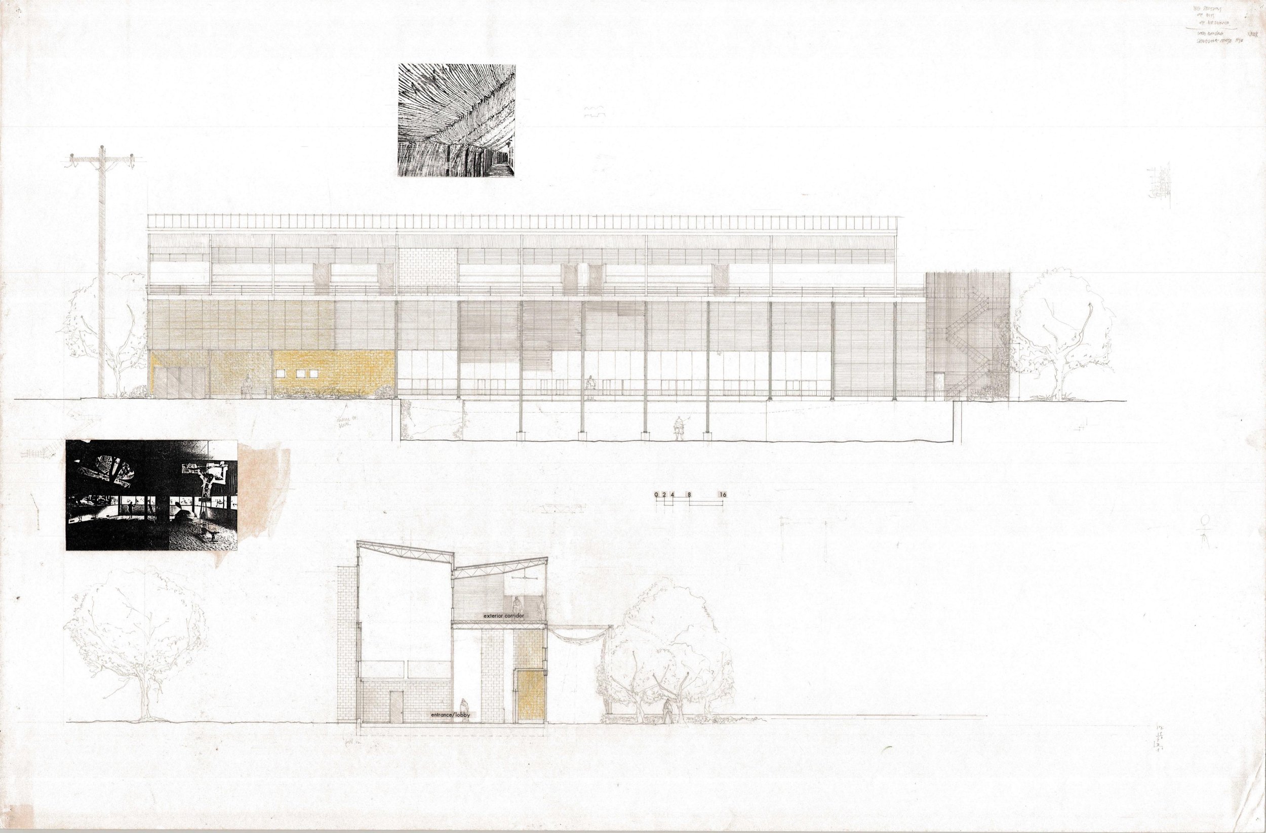
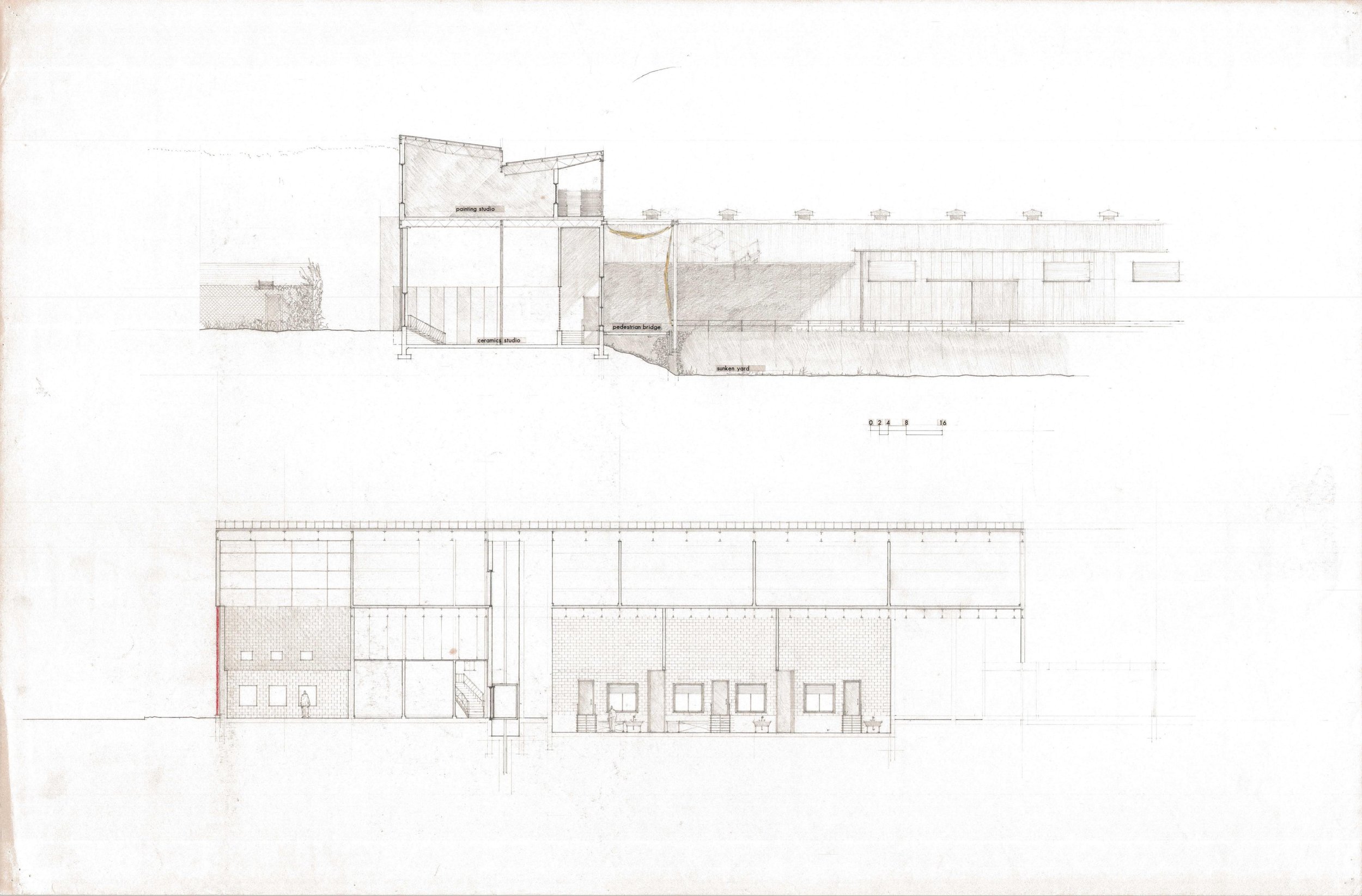
The following is an excerpt from a talk Jim Moses was invited to give to UBC SALA professor Chris Macdonald’s design studio in September of 2022.
When Chris invited me to talk to you today on this topic, I had two immediate thoughts. He told me he’d visited my small practice’s website and read the page there that spells out the principles under which the practice tries to operate, and I thought a) how nice that someone who isn’t trying to sell me website design services or search engine optimization has visited the website and b) I’d better re-read that page!
Still from “Slacker” (1990)
I want to say something about the name of the practice, Big Bend Studio. As Chris may have told you, we know each other from another lifetime, in the early 1990s, when we were both Texans by choice. Texas has probably always been an odd place inside a strange country. In the early 90s, Austin was a relaxed and politically liberal place. We actually had a governor who was not only a Democrat, but also a woman! Richard Linklater’s cult film “Slacker” which came out in 1990, captured the vibe of the place and time. See it if you haven’t. Today Austin feels closer to LA. Lots of valet parking.
Austin’s in central Texas, wedged between the prairie, the piney woods and bayou, and the basin and range of the Chihuahuan desert. These landscapes are distinct and unique, though today you need to squint to see them through the artifice of human occupation. The desert is not like that. It is inhospitable to settlement: bright and harsh and beautiful.
Rio Grande, West Texas
When I visited west Texas in 1993, it was the first time I’d walked in a desert and the experience stayed with me. The practice is named for Big Bend, the national park in that abuts the Rio Grande, to harken to that experience and, less directly, to my time in Austin, which was formative to me as a person and an architect. I also didn’t want to put my name on the practice, as a way of inviting collaboration and downplaying the idea of the singular author, issues that I know you are discussing this semester.
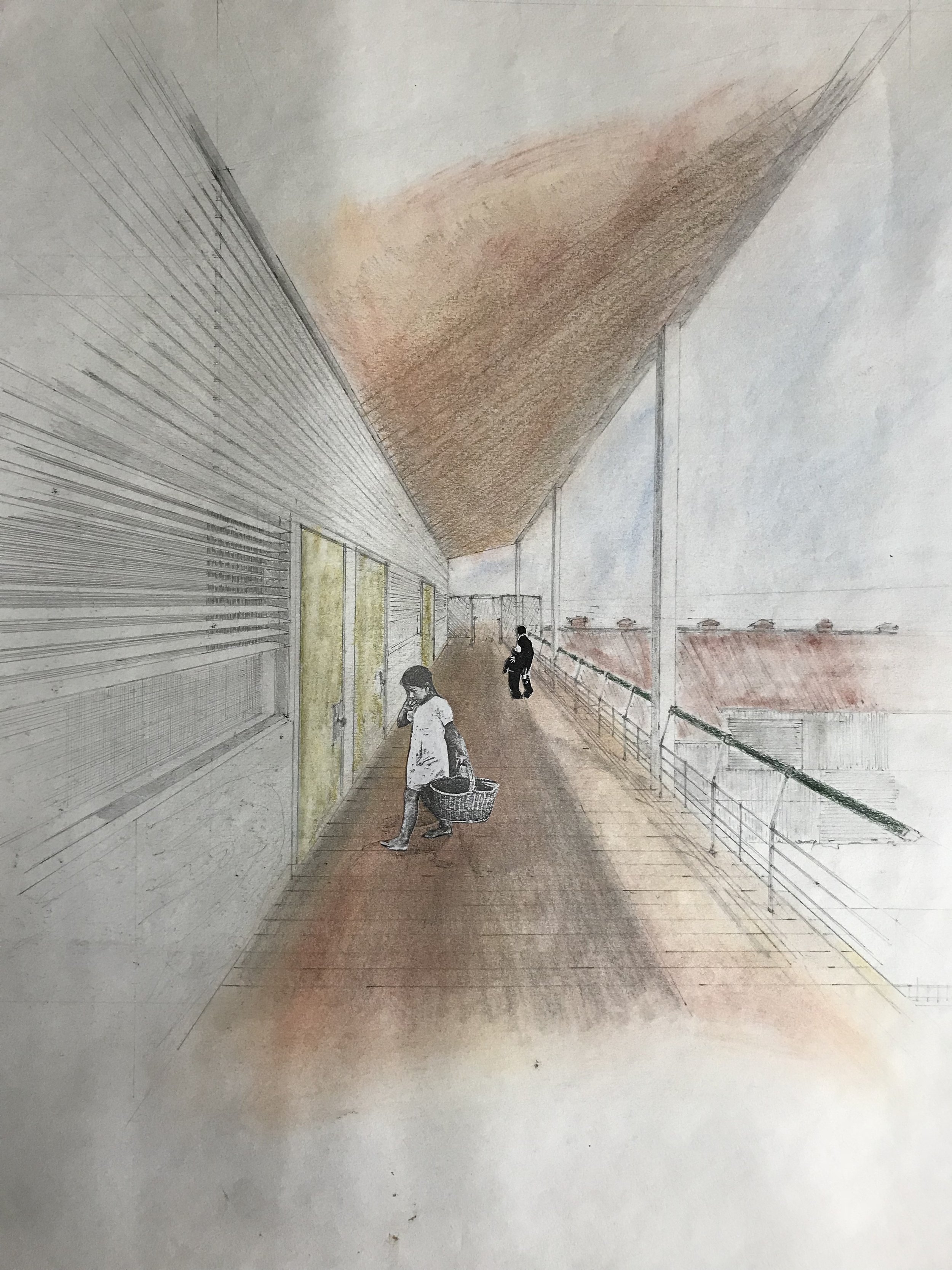
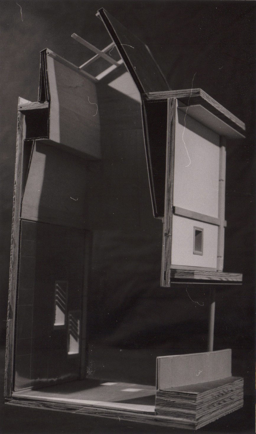
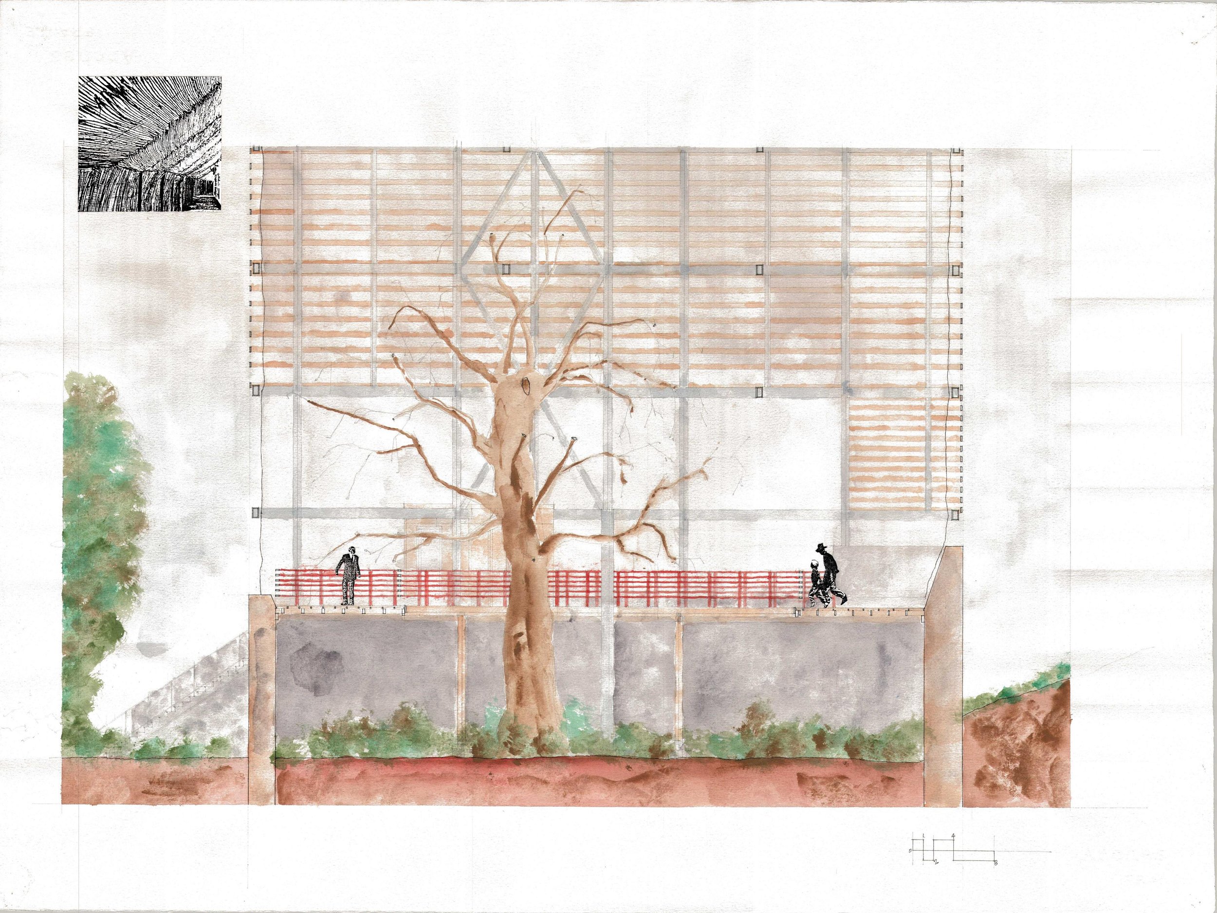
Very quickly, I want to show a few images of work that I did in three different studios that I took with Chris. I want to show these because one of the principles we discuss has to do with the idea of ‘building as a verb’, a phrase I stole from Chris. It may be the underpinning of all of the principles and points to the idea that there is no architecture without construction. These projects are all naive attempts by someone who had never built anything to be explicit about how the architecture could be realized, at least in terms of structure and enclosure. For me, the key to these investigations was the section and to some extent the elevation. The plan was always secondary and often quite underdeveloped. When I did re-read the principles, which were written down in 2017 after leaving behind twenty-five years of practice with large firms working on campus architecture and planning projects, I realized that many of them are echoes through time. They connect very directly to conversations Chris and my graduate colleagues and I had over the years in Austin. A few of those colleagues ended up back in Boston with me, and we continued to have similar conversations while trying to establish ourselves as practitioners and teachers.
I appreciate this quote from the Czech writer, Milan Kundera, because it seems particularly apt to architecture. Very little of what we do hasn’t been done in some way before. Each project has its own conditions that lead to a unique resolution, but the components of every project are likely to have precedents, even the expressive aspects.
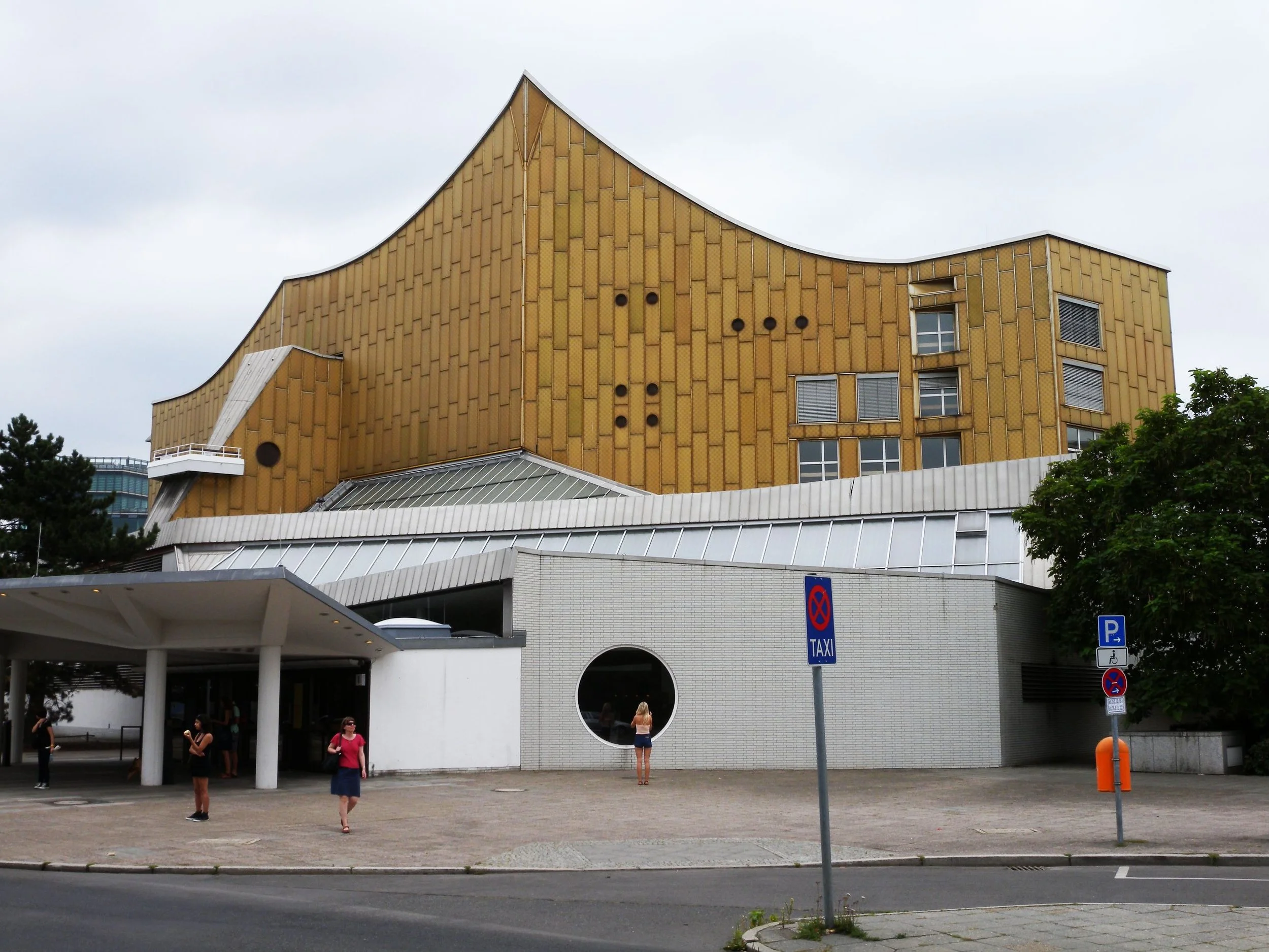
Hans Scharoun’s Berlin Philharmonie
Even Frank Gehry, whose Guggenheim Bilbao Chris showed in his introduction to this studio as an example of manifest expressiveness, and who has always been heralded as an utter original, I would argue traces a line from architects like Hans Scharoun.
Gehry’s Guggenheim Bilbao
Even today, twenty-five years later, Bilbao is probably considered Gehry’s most iconic building. ‘Iconic’ is the right word and speaks to one role that architecture plays in the world. It’s the same role that it has played since there were pharaohs and kings and powerful popes. Now architecture does this for corporations, universities, and museums. It’s a kind of branding.
In the case of the Guggenheim, the silhouette appears as Bilbao’s avatar, or icon, on Iberia’s world tourism map along with Sagrada Familia and a collection of Baroque and medieval palaces and cathedrals of the peninsula. This is a rarified architecture and one that’s celebrated in architecture schools in this country. It’s the proverbial one percent.
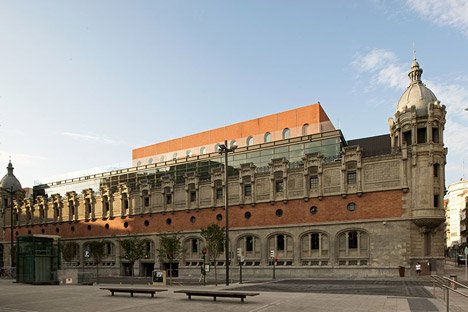
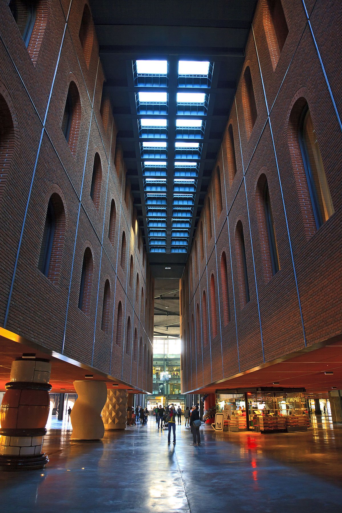
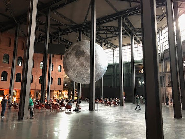
As a brief aside, I think Bilbao’s more compelling project is the Azkuna Zentroa, a wine warehouse built in 1906 and repurposed by Philippe Starck in 2010 as a cultural center. It’s now a nesting doll of a building within a building. The ground floor is a kind of interior public park, the culmination of the street outside, that can be occupied without a commercial imperative: you don’t have to buy anything in order to be welcome there. There are shops and galleries and a movie theater at the perimeter and more private functions, like a hotel and offices, in the buildings above, supported on uniquely sculpted columns representing moments in Basque history and folklore.
I think it’s important to be clear-eyed about architecture’s broader place in culture. In a 1991 essay, Kenneth Frampton reminded us that only about twenty percent of the world’s building activity is subject to architects’ advice. I have no reason to think that this proportion should have changed since then. This is where we can try to draw a distinction between architecture and building, where the vast majority of the built environment is not, strictly speaking, architecture. The Guggenheims of the world are the rarest of the rare. And most of us operate somewhere between them and the 80% of building activity that is happening without our input. Architects play a relatively minor role in producing the built environment.
Posse East, Austin
That’s not to say that there aren’t valuable and vibrant arrangements and constructions that we have nothing to do with. There are and in fact there is often much we can learn from them in how they support and foster sociability in less formal, less designed, often more generous ways.
Kendalia Halle, Kendalia, Texas
These are what might be considered vernacular buildings that are often designed in a closer relationship to climate and material availability, and with the relative talents of local labor, sometimes DIY, in mind.
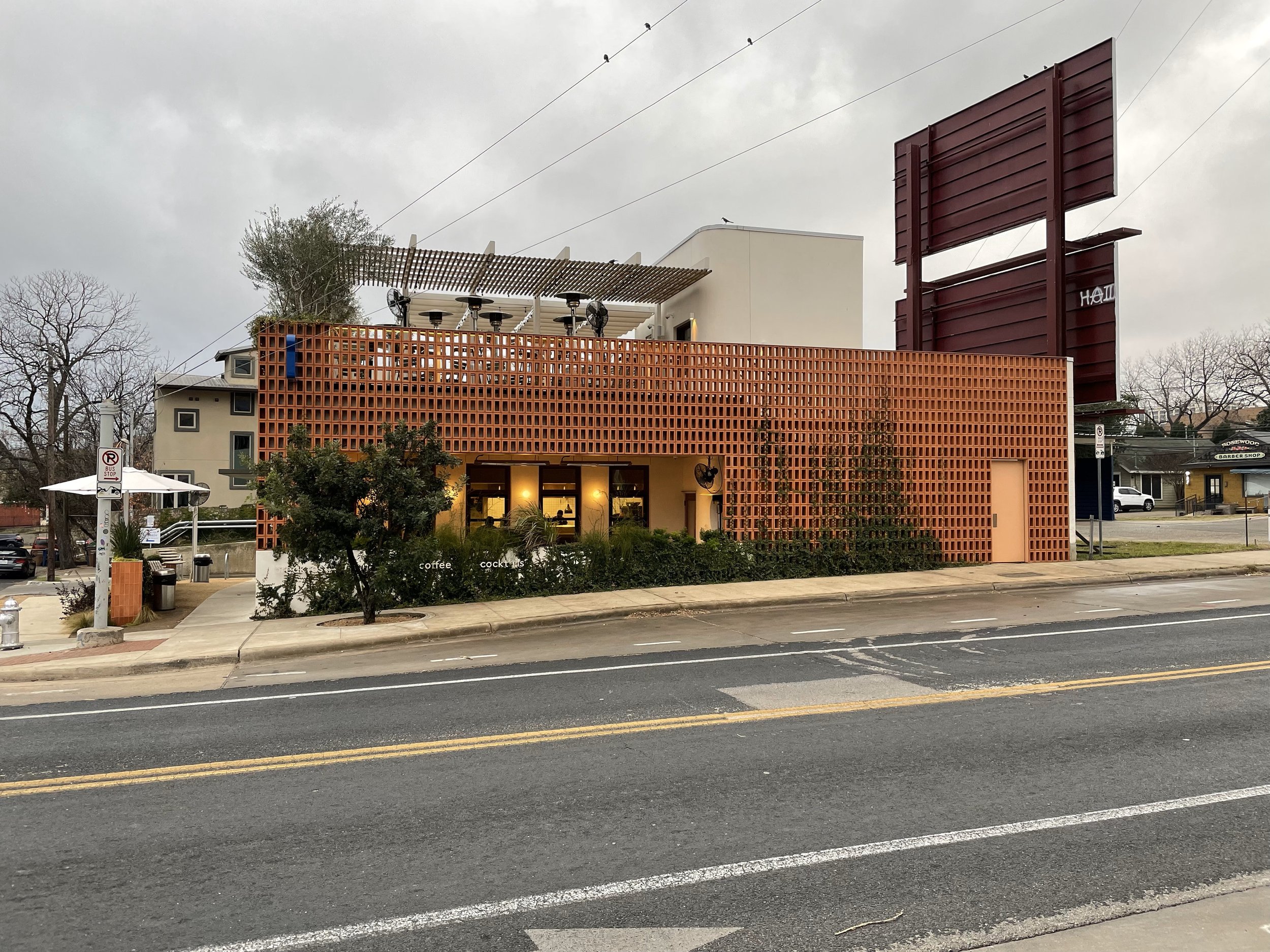
Chioco Design’s Paperboy Cafe, Austin, Texas
The lessons may be particularly apt when we begin to distinguish between foreground and background buildings. Design of background buildings is where most of us spend our professional lives.
Kitchen of the Gehry House, Santa Monica, California
I suppose I have a greater affinity for Gehry’s own house in Santa Monica. Not because of the formal gestures, which presage the Guggenheim and others, but in its modesty, regard for everyday life, and manifest interest in construction systems,
which get masked at the Guggenheim, like the armature that holds up the Statue of Liberty or a Balenciaga dress.
Gehry House, Santa Monica, California
This may also say something about the use of computer modeling and its role in fabrication, which Gehry’s firm pioneered, as opposed to constructions in which the hand of the builder, a human being, is apparent. Where imperfection is permissible, if not invited, because it is inevitable. This is a building that knows it’s a building and isn’t trying to be something else. Which, I guess, represents a kind of honesty or forthrightness. I don’t mean this in terms of 'structural honesty’ that we hear so much about in architecture school and carry as baggage into our professional lives, but to describe the structure of a sensibility or a predilection. I prefer buildings that are buildings, not built metaphors.
Tobacco barn, Hatfield, Massachusetts
For me there is sufficient poetry in a tobacco barn. It tells a story of occupying the crust of the earth.
These are stories that feel more urgent to tell when you have guys like these two trying to leave the planet behind, as if it’s a lost cause, at least for those with the means to leave.


